Case Study — 03
- Company
- Yara International
- Title
- Senior Product Designer
- Team
- 1 DS Designer · 2 DS Engineers
- Period
- Sep 2020 – Oct 2021
- Stack
- Figma · React · Storybook
Fertilise Design System
Yara's first attempt to unify design styles across products. Built solo, it transformed design from ad-hoc decisions into a shared, operational language across teams.
Reusable components built as a team of one
Design–engineering discussions reduced
Handoff time between design and engineering
Yara project built entirely on a design system
One company.
No shared language.
Yara International is a Norwegian multinational operating in over 60 countries, producing fertilisers, crop nutrition products, and digital farming solutions. Its Digital Farming division was split between two large groups: Smallholder farmers in Asia and Africa, and Professional Farms across the Americas and Europe — both building products to help farmers increase yields and reduce agriculture's environmental impact.
Yara's acquisition of multiple digital startups resulted in a portfolio of products with inconsistent design decisions—buttons, type scales, and colours varied by team, and UI patterns differed across products without documentation or sharing, forcing teams to repeatedly solve the same problems.
I was brought in as the sole designer to turn a loose Figma component collection into something the organisation could actually rely on. That meant more than building components — it meant defining the architecture, naming logic, and documenting the model that would let a distributed team use the system consistently without needing me in every decision.
Audit before
architecture.
A design audit of Atfarm — Yara's flagship product — confirmed the need for change, revealing inconsistent button treatments, a lack of type scale, and inline colours without a common palette. The audit gave the team the language to address known issues.
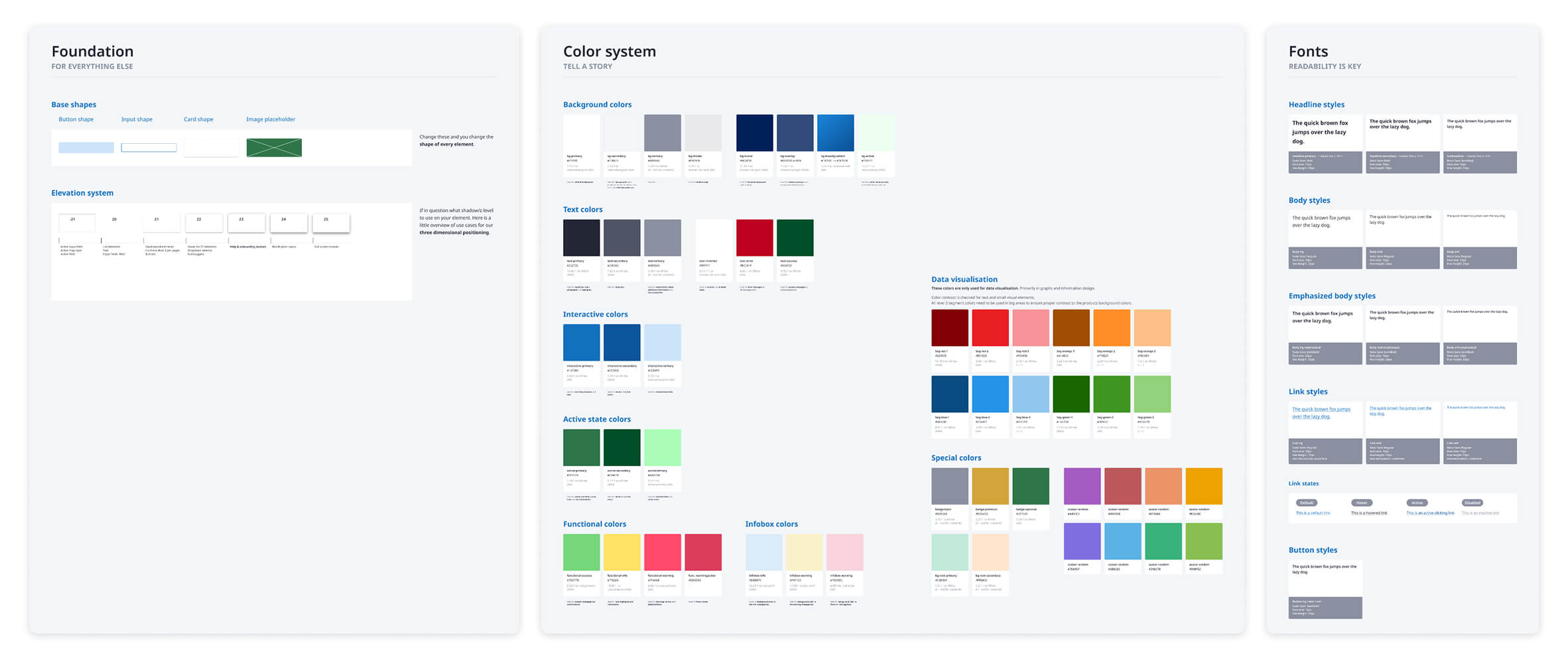
From there, two designers and I mapped the patterns that consistently appeared across screens and platforms and stripped out the one-off variations. The first version of Fertilise wasn't a designed system — it was an observed one. We documented what Yara's products already had in common and used that as the foundation, rather than imposing something new from scratch. The result was a loose Figma library, limited by Figma's tooling at the time, but a foundation the team could point to.
Tokens first.
Components second.
The key decision was to introduce a two-layer token model before designing any components. Primitive tokens defined raw values—hex codes, pixel sizes—while semantic tokens mapped them to decisions, such as colour.feedback.error or space.component.padding. Because the library was small, we kept it simple and didn't add component tokens.
This was enough for developers to understand without needing to ask what red meant in context — the token name told them. A designer updating the error state didn't need to audit every instance of red — they updated one semantic token.
A collaboration with the Global Brand team on our new colour tokens led to an agreement that we needed to adjust the colours for digital spaces, since the Yara brand palette was mostly focused on print design. We needed clearer colours that would be readable on all kinds of screens, especially in the middle of the field under bright sunlight.
Refactor.
Simplify.
Name it.
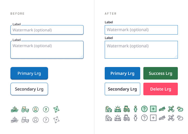
The first version of Fertilise lacked a token structure and naming conventions and relied on isolated visual decisions, which became a maintenance burden at scale. When the project stalled, I rebuilt the library using our defined token architecture rather than patching the original.
Visual complexity was reduced for maintainability, not aesthetics. Flat components with semantic colour tokens are easier to theme, audit, and hand off than those with raw values. Consistent naming makes the Figma library self-documenting. Naming it the Fertilise Design System gave it an identity that "Component Library" never could.
First proof
of concept.
FDS was used for a complete rebuild of Atfarm, and it was the fastest way to stress-test the system under actual conditions. While designers used the design system in Figma, we quickly identified missing states and patterns. Decisions that seemed solid in the abstract broke down in practice. Some components were too rigid for the product's edge cases; others were too loose, leading each designer and developer to make different assumptions about how to use and implement them.
Rather than patching issues ad hoc, we introduced weekly design-engineering reviews for design files to identify gaps and introduce flexibility into the process. This gave FDS its first real feedback loop and produced a backlog of system decisions that would have otherwise lived only in someone's head.
While the system quickly grew in Figma, we still lacked engineering staffing to develop the design system, so components were built ad hoc within the product itself, leaving many gaps.
Team of one
becomes a
real team.
When Philip and Alexandra joined as engineers, the focus shifted to maintaining standards and externalising decisions—such as component API constraints and token boundaries—making the system scalable for others to build on.
It was the first version of FDS to be formally built in code, rather than having just loose components in the live product. While the Atfarm rebuild was already in full swing, the engineers supported the team and guided them in using the new design system.
In the meantime, I introduced a three-track contribution model: consuming, extending, and proposing components, each with specific documentation requirements. This enabled system growth while maintaining standards. Regular onboarding for designers ensured system adoption without my direct involvement.
Consume
Use components exactly as documented — no modification
No docs requiredExtend
Add a documented variant to an existing component
Usage note requiredPropose
Introduce a net-new component through review and sign-off
Full review + docsShipped.
Documented.
Adopted.
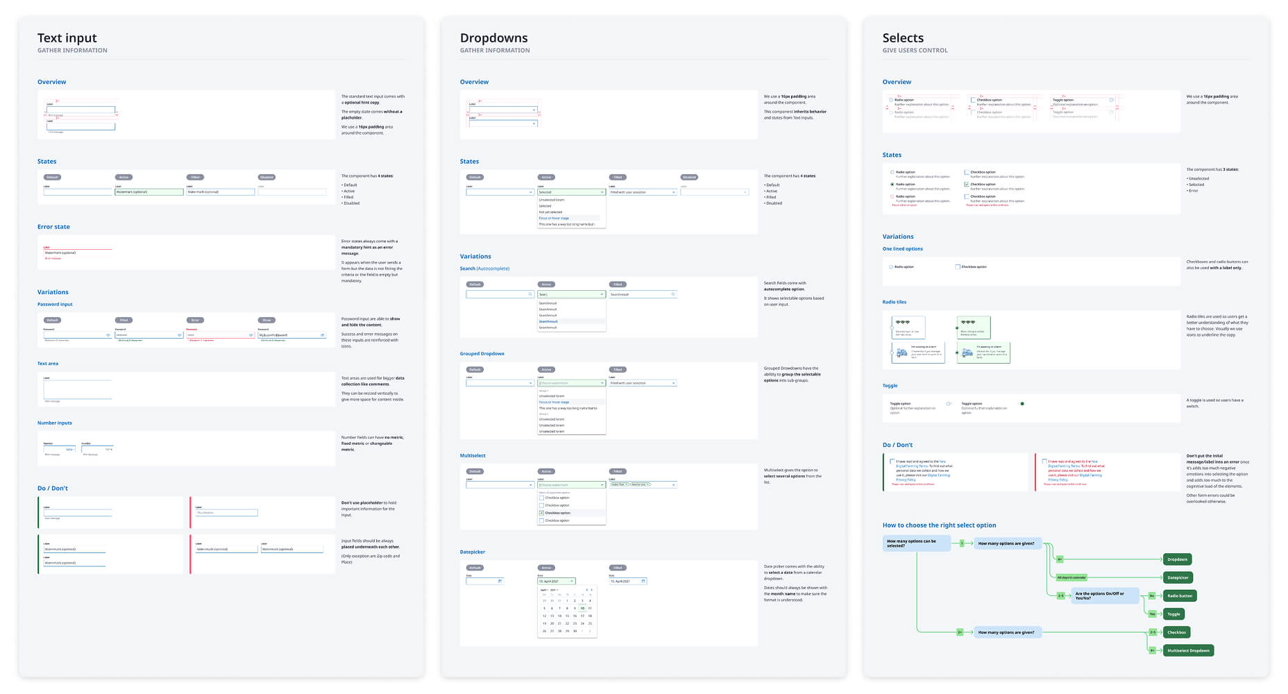
FDS launched with two primary surfaces: Figma and Storybook. In Figma, every component had a dedicated usage template—a structured page that showed real-world examples, edge cases, anti-patterns, and the token connections underpinning each decision. In Storybook, every component had interactive states, prop documentation, and accessibility notes alongside the live implementation.
Every usage template followed the same four-part structure: what the component is, when to use it, when not to use it, and which tokens it consumes. The "when not to" section was the most contentious to write—and the most referenced. Defining where a component ends is more useful than describing its default state, because that's the moment teams need guidance most.
What actually
changed.
FDS delivered key outcomes: a unified visual language, a comprehensive component library, accessible guidelines, and a token-driven decision process. The system enabled product standardisation, served as the source of truth for teams, and made onboarding faster and easier.
- →
40+ reusable components generated and rolled out as a team of one
40+components - →
Design–engineering discussions were reduced, and collaboration and efficiency improved by replacing fragmented UI with a unified style guide
−70%fewer debates - →
Handoff time between design and engineering is cut by eliminating repetitive specification work
−40%handoff time - →
FDS was adopted as the official design system for a complete product rebranding at Yara
1stofficial rebrand - →
For the first time, the Digital Farming team partnered directly with the Global Brand team to align design standards and brand expression
2teams aligned
Lessons that
cost something.
FDS was my first design system. I learned an enormous amount — but the most valuable lessons came from the things I got wrong. These aren't failures, but they shaped every system I've built since.
I didn't advocate for the work
I didn't effectively communicate the benefits of design systems and token structures to the team and stakeholders. The project didn't get the visibility it deserved because I wasn't making the case for it. Showing impact early and loudly matters.
Tokens should have come first
I introduced the token structure mid-project rather than from day one. This meant retrofitting architecture onto components that weren't designed for it — creating work that could have been avoided entirely with upfront planning.
Documentation was an afterthought
Docs were written after components were built, not alongside them. This created a gap between the system's capabilities and what teams actually knew how to use. Documentation should ship with the component, not after it.
Working alone has limits
Building a system as a team of one is possible — but it creates a single point of failure and limits how much the system can be challenged and improved. I brought this lesson directly into Ahua, where we built the team first.